Standing in a paint shop staring at a wall of color swatches, feeling completely overwhelmed — has this ever happened to you? You’re not alone. Figuring out how to choose paint color for an entire house is one of those decisions that feels simple until you’re actually holding forty shades of “off-white” and can’t tell them apart anymore.
I’ve repainted my own home twice now, and both times I underestimated how much lighting, room size, and even furniture color would affect the final result. A shade that looked perfect on the swatch card looked completely different once it covered four walls under our living room’s lighting.
This guide walks through picking colors room by room, based on how each space actually gets used — not just what looks trendy in a magazine spread. Because a color that works beautifully in a bedroom might feel completely wrong in a kitchen, and there are real reasons for that.
Start With How Each Room Actually Gets Used
Choosing paint color starts with understanding a room’s function and mood before its aesthetics — energizing colors work well in kitchens and home offices, while calming tones suit bedrooms, and social spaces like living rooms can handle bolder choices. Function should guide color, not the other way around.
This sounds obvious written out, but it’s the step most people skip. They pick a color they love in isolation — say, a rich navy blue — without asking whether that color actually suits how the room gets used day to day.
A few questions worth asking before you even look at swatches:
- Is this a room you relax in, or one where you need to feel alert and focused?
- Does natural light flood the space, or is it mostly artificial lighting?
- How much time do guests actually spend in this room versus just family?
- Will this color still feel right in five years, or is it chasing a current trend?
I’ll admit a personal bias here — I think too many homeowners lean toward whatever’s trending on Pinterest without asking if it actually fits their lifestyle. A moody dark green bedroom looks stunning in photos. Living with it every single morning when you’re trying to wake up is a different experience entirely.
Understanding Undertones — The Detail Everyone Misses
This is genuinely the single biggest reason paint jobs go wrong, and almost nobody talks about it until it’s too late.
Every paint color, even a seemingly simple white, has an undertone — a subtle hint of another color hiding underneath. Whites can lean yellow, pink, grey, or blue. Beiges can lean green, pink, or grey. You often can’t tell just by looking at a small swatch card.
Undertones become obvious once paint is on a full wall, especially under natural daylight, and mismatched undertones between adjacent rooms or against your flooring and furniture is one of the most common paint color mistakes homeowners make.
Here’s a practical way to test for undertones before committing:
- Buy a small sample pot, not just the swatch card
- Paint a section directly on your wall — at least a two-foot square, not a tiny patch
- Look at it at different times of day: morning, afternoon, evening under artificial light
- Compare it against your existing flooring, furniture, and curtains in the room
Skipping this step is exactly how people end up with a “white” living room that looks faintly greenish next to their marble flooring. It’s a frustrating, expensive mistake to fix after the fact.
Living Room: Balancing Warmth and Versatility
The living room usually sees the most foot traffic and the widest range of activities — family time, guests, kids playing, maybe even a home office corner. That versatility should guide your color choice.
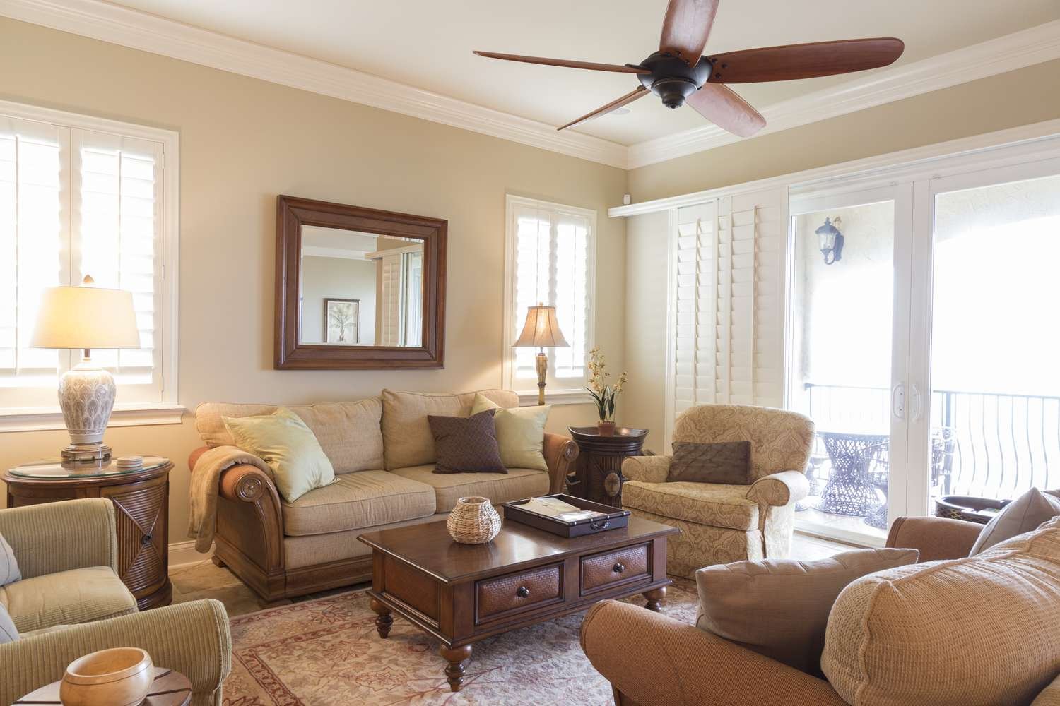
Warm neutrals work beautifully here — think soft beiges, warm greys, or a muted taupe. They’re flexible enough to work with almost any furniture and décor style, and they don’t date quickly the way trendier colors sometimes do.
If you want more personality, one accent wall in a deeper tone — a muted terracotta, a soft sage green, a warm charcoal — adds character without overwhelming the room. I genuinely think a single well-chosen accent wall does more for a living room’s character than an all-over bold color choice, which can start to feel heavy after a while.
For smaller living rooms, lighter shades help the space feel bigger, especially important in compact city apartments where every square foot matters. [link to related guide on paint colors that increase home resale value here]
Bedrooms: Prioritize Calm Over Trendy
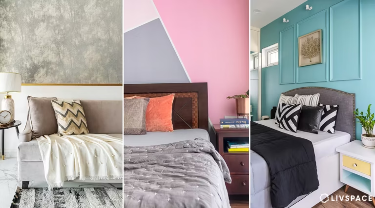
For bedrooms, soft cool tones like muted blues, sage greens, and gentle greys tend to promote a more restful atmosphere, while warm neutrals like soft terracotta or blush also work well for a cozy, grounding feel. The goal is calm, not visual excitement.
A bedroom is fundamentally different from every other room in the house — it’s where you’re trying to unwind and sleep, not entertain or stay energized. Bright, saturated colors that work great in a living room can feel jarring in a space meant for rest.
That said, I don’t think bedrooms need to be boring either. A deep, moody navy or forest green can feel genuinely luxurious and restful if done well, especially paired with warm lighting and soft textiles. It’s not about avoiding all depth of color, it’s about avoiding anything visually loud or high-energy.
Avoid, generally:
- Bright reds or oranges — energizing colors, wrong mood for a bedroom
- Stark, cold whites, which can feel clinical rather than cozy
- Anything too saturated on all four walls, which can feel overwhelming rather than calming
Kitchen: Energy Meets Practicality
Kitchens need a slightly different approach because of grease, moisture, and constant cleaning — practical concerns that matter as much as aesthetics here.
Go for a paint with a semi-gloss or satin finish rather than matte, since it holds up better to cleaning and resists moisture more effectively. Color-wise, warm whites, soft yellows, and light sage greens are popular for good reason — they keep the space feeling bright and energizing, which matters for a room where you’re often up early or cooking late.
Picture a small business owner in Jaipur who runs a home bakery out of her kitchen. She went with a warm buttery yellow a few years back, specifically because it felt cheerful during long early-morning baking sessions. Small detail, but it genuinely changed how the space felt to work in every day.
Bolder kitchen colors — deep blues, forest greens on cabinetry especially — have become popular recently too, and they can look stunning if the rest of the kitchen has enough light and neutral surfaces to balance them out.
Bathrooms: Light, Fresh, and Moisture-Resistant
Bathroom paint choices should prioritize moisture-resistant finishes alongside color — light blues, soft greens, and warm whites work particularly well, paired with a mildew-resistant, semi-gloss or high-gloss paint suited for humid environments.
Moisture is the real enemy in bathrooms, so whatever color you land on, don’t skip the practical side of the decision. A beautiful color choice with the wrong finish will peel or develop mildew spots within a year or two in a humid Indian bathroom.
For smaller bathrooms, which describes most Indian homes honestly, lighter colors genuinely help the space feel less cramped. Soft aquas, pale greys, and warm whites are reliable choices that photograph well too if you’re planning to sell eventually.
If your bathroom gets good natural light, you have more flexibility to go slightly bolder — a deeper teal or navy can look striking without making the space feel smaller, since natural light balances out the visual weight.
Home Office or Study: Focus-Friendly Colors
More people are working from home now than a few years back, and the paint color in that space genuinely affects focus and mood over long stretches of time.
Cooler tones — soft blues, muted greens, light greys — tend to support concentration better than warm, energizing colors that are great for social spaces but can feel distracting during long work sessions.
- Soft blue: associated with calm focus, good for tasks requiring sustained concentration
- Muted green: balances energy and calm, a solid all-around choice for a home office
- Light grey: neutral and professional-feeling, works well for video calls too since it doesn’t clash with most backgrounds
Avoid very dark or saturated colors in a small home office, especially if the room doesn’t get much natural light — it can start to feel closed-in over an eight-hour workday.
Testing Colors the Right Way Before You Commit
Don’t trust the swatch card. I really can’t emphasize this enough, because it’s the mistake that leads to the most repainting regret.
A color that looks lovely on a 2×2 inch card can look completely different across an entire wall, under your specific lighting, next to your existing furniture. Lighting changes everything — a north-facing room and a south-facing room will make the exact same paint color look noticeably different.
Steps for testing properly:
- Buy small sample pots of your top 2-3 choices, not just one
- Paint large swatches directly on the wall, at least 2×2 feet, in different corners of the room
- Observe them across a full day — morning light, afternoon, and evening with your regular lights on
- Live with the samples for at least 2-3 days before deciding, rather than choosing on day one
[link to related article on interior paint finishes and their uses here]
It feels like an extra, tedious step when you’re eager to get started. But it’s genuinely the difference between loving your walls for years and repainting again within twelve months because the color felt wrong the moment it dried.
Frequently Asked Questions
What’s the best paint color for a small room to make it look bigger? Light, cool-toned neutrals — soft whites, pale greys, light blues — reflect more light and create a sense of openness. Avoid dark, saturated colors in small spaces, since they tend to make walls feel like they’re closing in.
How do I choose a paint color that matches my furniture? Bring a fabric swatch or photo of your furniture to the paint store, and test your shortlisted colors against it in natural light at home before deciding. Undertones matter more here than the color name suggests.
Should all rooms in my house have the same paint color? Not necessarily, though a consistent color palette or family of tones across connected spaces creates a more cohesive flow. Individual rooms like bedrooms or a home office can differ more freely since they’re separate, private spaces.
What paint finish should I use in high-humidity rooms like bathrooms? Semi-gloss or high-gloss finishes hold up best against moisture and are easier to clean, which matters a lot in bathrooms and kitchens where humidity and grease are constant factors.
How many paint samples should I test before deciding? Two to three shortlisted colors is usually enough. Testing more than that tends to create decision fatigue without meaningfully improving the outcome — trust your instinct once you’ve narrowed it down.
Do darker paint colors make a room feel smaller? Generally yes, though not always negatively — a dark, moody color in a room with good natural light and minimal furniture can feel cozy and intentional rather than cramped. It really depends on the room’s lighting and purpose.
Conclusion
Figuring out how to choose paint color for your whole home doesn’t need to feel overwhelming once you break it down room by room. Match the color to how each space gets used, always account for undertones, and never skip testing samples directly on your walls before committing to gallons of paint.
Pick one room to start with this weekend — maybe the one that’s bothered you the longest — and just test two or three sample pots on the wall. You’ll likely find the right shade faster than you expect once you stop trying to decide everything at once.